The purest of waters

The purest water in the world, bottled in Spa Monopole. A national icon and a product trusted by millions all over the world. No other water brand can claim to have the same purity and minerality, thanks to the all-natural filtration process. This purity lays at the core of everything SPA does. It’s the heart and soul of the brand.

We were tasked with rebranding this icon, from main visual identity over packaging design to brand communication level. With a brand that offers everything from pure mineral water to all-natural lemonades, the challenge was to create an overarching visual system that harmonizes the entire SPA product range and all its communications.
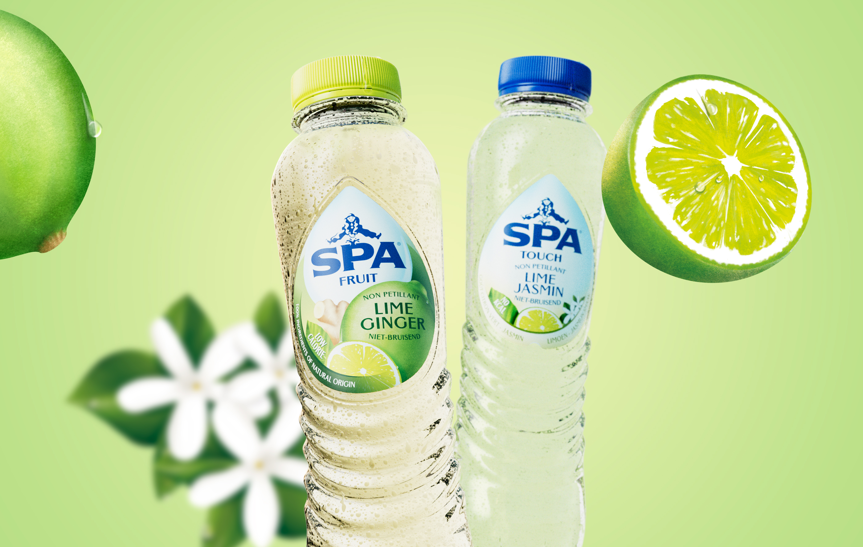
We introduced a water drop as key visual brand element on every level of the new identity: drop-shaped labels, a water ripple embossed bottle design and a drop-shaped distortion on all visuals. The result: an entire design system centered around the drop, expressing the purity of SPA.

“WeWantMore succeeded wonderfully in expressing the association between Spa and purity with a strong visual concept, masterfully executed throughout the entire brand.”

- Melanie Decelle, Marketing Director at Spadel

A new bottle design

The overall bottle shape still uses the same female taille curvature that SPA has always been known for. But we adjusted the overall look and feel of the bottle to infuse the design of the range with purity. Taking away the unnecessary embossed details and reducing the design to a simple bottle that solely focuses on the core of the brand.

Packaging design

For the packaging design, we went for contemporary heritage featuring hand-drawn illustrations, toned-down colors, and a modern Gothic typeface. A visual identity that brings the iconic Belgian brand back to the 21st century. Between the different sub brands, we created a consistent design system that uses the water drop as a jumping-off point.

SPA Waters

The packaging for the SPA waters needed to communicate “pure water”. So, the shape of the label has changed to a water drop, hand drawn to bring back a hint of nostalgia and the heritage of the brand.

SPA Touch

SPA Touch follows the same visual clues as the SPA waters. We only added an extra layer to show that it’s water with a touch of fruit.

SPA Fruit

We changed the design of the SPA Fruit label to show a smaller SPA water drop, combined with an abundance of fruit. Brightly colored bottle caps and the color green were also introduced as a category color to set the lemonades apart from the waters. The fruit illustrations were drawn by hand and done in-house.

Brand identity

Along with the new design for the packaging, the purpose “Drink better. Live better.” came into existence. SPA wanted to launch a 360° campaign focusing on the fact that they truly are the healthy, all-natural alternative on the market. And so, we created a visual identity system for all brand communications that are an extension of what is happening on a packaging level.

Just like on our packaging, the drop is the common thread through all brand communications. Depending on the medium, the drop can take on different shapes and sizes, but it will always be present in some way or form emphasizing the SPA logo.

Our visual guidelines were later used by other agencies such as Happiness and Spike to create a 360° campaign for the Belgian and Dutch market. Introducing a bold yet friendly typeface, the liquified drop surrounding our logo, use of color, a white frame... and so on.

More on our client SPA

Next case

Neuhaus rebranding