Category: Consumer goods
Services: Art direction Brand concept Brand strategy Concept Graphic design Identity design Motion design Packaging design Project management
Client: Kallis
Category: Consumer goods
Services: Art direction Brand concept Brand strategy Concept Graphic design Identity design Motion design Packaging design Project management
Client: Kallis
Category: Consumer goods
Services: Art direction Brand concept Brand strategy Concept Graphic design Identity design Motion design Packaging design Project management
Client: Kallis

Kallis finds the beauty that remains hidden and elevates it to the realm of the exceptional

Yes, Kallis creates light switches. But its concept of enlightenment far transcends the literal meaning. At its core, Kallis is about beauty. Harmony. A tangible, tactile connection with the spaces we call home. We brought this vision to life.
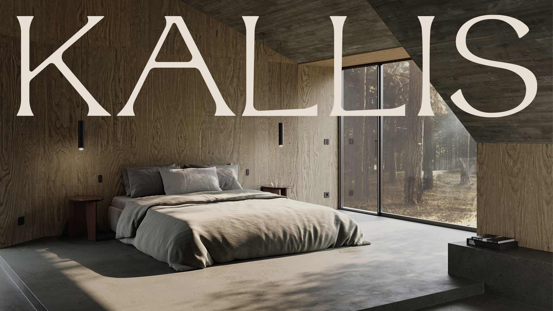
Light has a tremendous impact on us as human beings. It affects how we feel, operate, and perform. It defines when we relax, focus, or recharge. With its multifunctional light switches, Kallis gifts us intuitive control over one of the most essential elements of our lives.

 Kallis’ visual language had to convey the emotional story at the heart of its brand identity: pursuing beauty in all things, especially our surroundings.

So we got to work. It was clear from the start that surface-level design would not suffice. The name Kallis draws inspiration from Kalos — the ancient Greek ideal of pure, untainted beauty. Philosophers and poets described it as the harmony of spirit and matter.

WeWantMore led us on a transformative journey, challenging us to define our brand essence with the utmost clarity. After a collaborative naming process, WeWantMore created an inspiring visual identity, matching our DNA. Taking on the role of our strategic partner, WeWantMore went the extra mile in the creation of the brand, while continuously pushing us to new heights.

– Stefaan Van Den Broecke, Director at Kallis

The brand had to be a seamless extension and expression of the Kallis universe. Never over-designed or in your face, but elegant, timeless, and effortlessly luxurious. We were to create an identity that could be felt, rather than just seen or read about. So we started there — with the senses. 

In branding, the sense of touch is often overlooked. Considering Kallis’ emphasis on raw tactility and materiality, we knew we’d have to enhance these elements in whatever we came up with.

We kept the visual language minimalistic, understated, and timelessly elegant, giving tactility and narrative the space to peek through. Heavy, textured paper, subtle embossing and collateral materials make for a distinct sensory and tactile experience. 

The icon and logo are designed to be simple yet refined, with a font that conveys the brand’s prestige and status as a creator of timeless, luxurious objets d’art. 

Next case

Loop Earplugs