Stassen

- Revitalising Belgium’s historic cider brand

Sparkling Chic Meets Belgian Flair

Client:
Stassen
Year:
2025

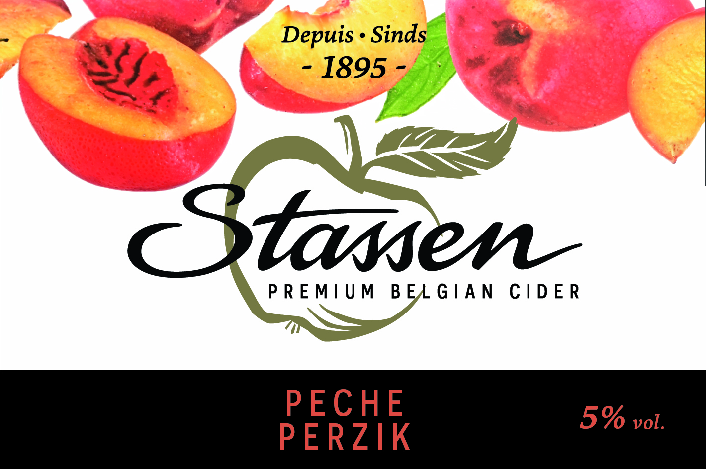
Since 1895, the Stassen range of fruit ciders has been Belgium’s go-to celebratory drink—an approachable alternative to sparkling wine enjoyed by generations. Rooted in apple orchards across Belgium, the brand has always been built on authenticity and festivity. But as the aperitif market expanded with spritzes and premium non-alcoholic options, Stassen’s design and positioning fell behind. Once a festive favourite, the brand had begun to feel outdated and disconnected, with its apple-cider origins no longer clear to consumers.

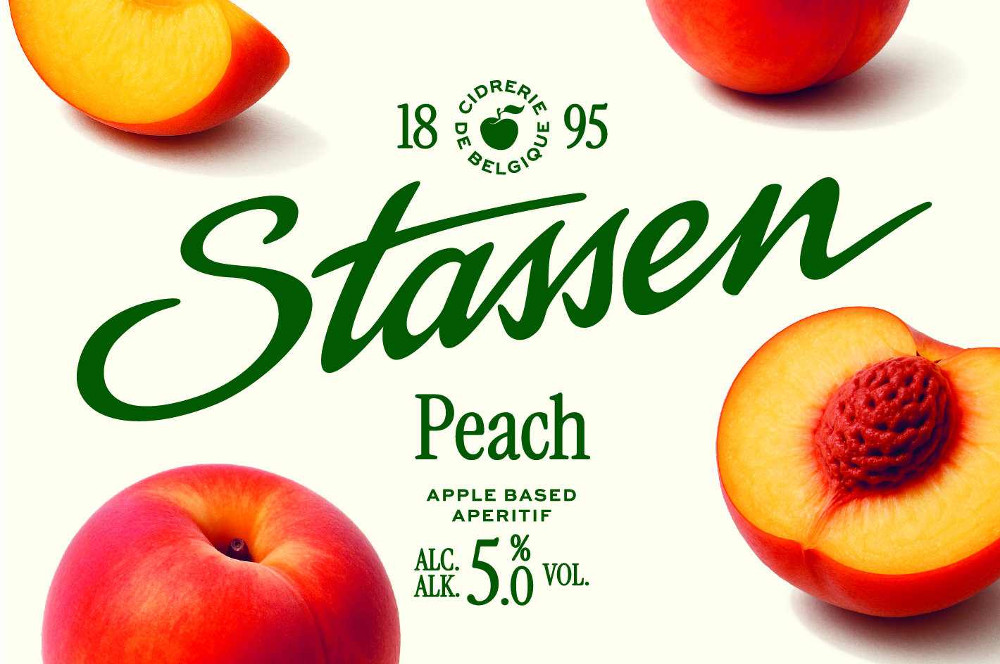
To bring back its sparkle, WWM reimagined the Stassen at its home in the Aubel cidrerie, combining the sophistication of festive drinks with the warmth, colour, and charm of Belgian design. We played with cues like lens flare photography, refined serif typography, and elegant detailing, but balanced them with vibrant colours, playful fruit compositions, and expressive layouts. The new design now feels premium yet refreshingly down-to-earth.

The redesign also refined and simplified Stassen’s existing assets, introducing a new seal featuring a cleaner rendition of the iconic apple and the founding year 1895 to celebrate its cider-making heritage. A warmer palette and lighter design language brought freshness and approachability, while the soft curls and characterful accents of the typography added a touch of wit and warmth.

The result is a confident, contemporary Stassen — refined but never rigid, Belgian at heart yet sparkling with modern appeal. By putting apples back at the centre, the brand once again shines as Belgium’s beloved celebratory drink: fruity, festive, and for everyone.

Stassen

- Revitalising Belgium’s historic cider brand
+ Project information

Sparkling Chic Meets Belgian Flair

Client:
Stassen
Year:
2025
What we did:
Brand Evolution ,
Motion Design ,
Packaging

Since 1895, the Stassen range of fruit ciders has been Belgium’s go-to celebratory drink—an approachable alternative to sparkling wine enjoyed by generations. Rooted in apple orchards across Belgium, the brand has always been built on authenticity and festivity. But as the aperitif market expanded with spritzes and premium non-alcoholic options, Stassen’s design and positioning fell behind. Once a festive favourite, the brand had begun to feel outdated and disconnected, with its apple-cider origins no longer clear to consumers.

To bring back its sparkle, WWM reimagined the Stassen at its home in the Aubel cidrerie, combining the sophistication of festive drinks with the warmth, colour, and charm of Belgian design. We played with cues like lens flare photography, refined serif typography, and elegant detailing, but balanced them with vibrant colours, playful fruit compositions, and expressive layouts. The new design now feels premium yet refreshingly down-to-earth.

The redesign also refined and simplified Stassen’s existing assets, introducing a new seal featuring a cleaner rendition of the iconic apple and the founding year 1895 to celebrate its cider-making heritage. A warmer palette and lighter design language brought freshness and approachability, while the soft curls and characterful accents of the typography added a touch of wit and warmth.

The result is a confident, contemporary Stassen — refined but never rigid, Belgian at heart yet sparkling with modern appeal. By putting apples back at the centre, the brand once again shines as Belgium’s beloved celebratory drink: fruity, festive, and for everyone.

Contact us

We’re only a call or click away

Let's talk

Newsletter

You're successfully subscribed!