Timmermans Boutique

Retail Timmermans
Services +
Concept Graphic design Interior design Packaging design Project management

Shop with your senses

Timmermans is a Belgian family-owned footwear store. After 145 years in the footwear and leather business, they found themselves at a crossroads: the next generation was about to take over. Timmermans decided to mark this occasion by opening a new 400 mᒾ venue.

Aware of the ascent of online retail, Timmermans wanted to play to their strengths by offering customers a tailored shopping experience that stimulated the senses. You can feel the shoes and clothes. You can touch them. Slip them on. Even smell them. That’s where a physical store trumps its digital equivalent.

We translated this sensorial advantage into an innovative store layout based on the four elements: earth, water, air and fire. And worked closely with Timmermans to establish this vision across the interior.
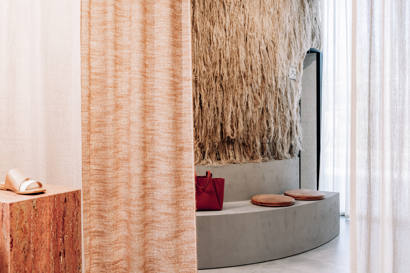
We divided the T-shaped store into four distinct zones. Each represented one of the four elements. A flexible curtain system zig-zagged across the length of the space, separating every area.

Smack in the middle of it all: the fitting rooms and checkout zone. They’re more neutral, yet highly tactile. The flax covering the fitting rooms almost demands to be touched.

Earth, water, air and fire.

Every shopping zone includes an object recalling one of the four elements. Some of these references are direct, some more poetic. 

For instance, a terracotta-colored construction dominates the earth themed corner, its nooks displaying premium women’s footwear. In the men’s section, a burnt metal wall panel hints at the element of fire. It curves around a corner, transitioning into a fire-themed women’s section.

'Relax in an oasis of peace. People instantly feel at ease.'

Carole Timmermans

The concept of the four elements resurfaces throughout the entire store. Display systems and volumes in red travertine, raw concrete bricks, blackened wood and tree logs hint at earth and fire, while cathedral glass, semi-transparent curtains and Oskar Ziet’s Plopp stool add water and air to the interior.

Unlike most retail stores, Timmermans’ new store isn’t simply constructed of fixed shelving and display walls. We added a curated selection of individual tables, columns and furniture, all of which can be rearranged at will. This gives the freedom to switch things up when a new collection arrives.

Visual identity

The visual identity incorporates Timmermans’ history and emphasizes its future. The rich, masculine past mingled with a bright, female-led tomorrow. At the identity’s core is a minimalistic wordmark seemingly weathered by the elements. Soft and feminine on the left. Sharp and virile on the right. The understated color palette and the scrapbook style add to the notion of Timmermans’ long expertise shaping the future.

Next case

Bath & Barley

Hospitality