HG

- Precision in Packaging

The Architect of Excellence

Year:
2026
Client:
HG
Website:

From Clutter to Clarity

HG is the expert. For over 60 years, the brand has been trusted across the Benelux for highly effective, problem-specific cleaning solutions.

But as the range expanded, the brand lost the clarity the products were known for.

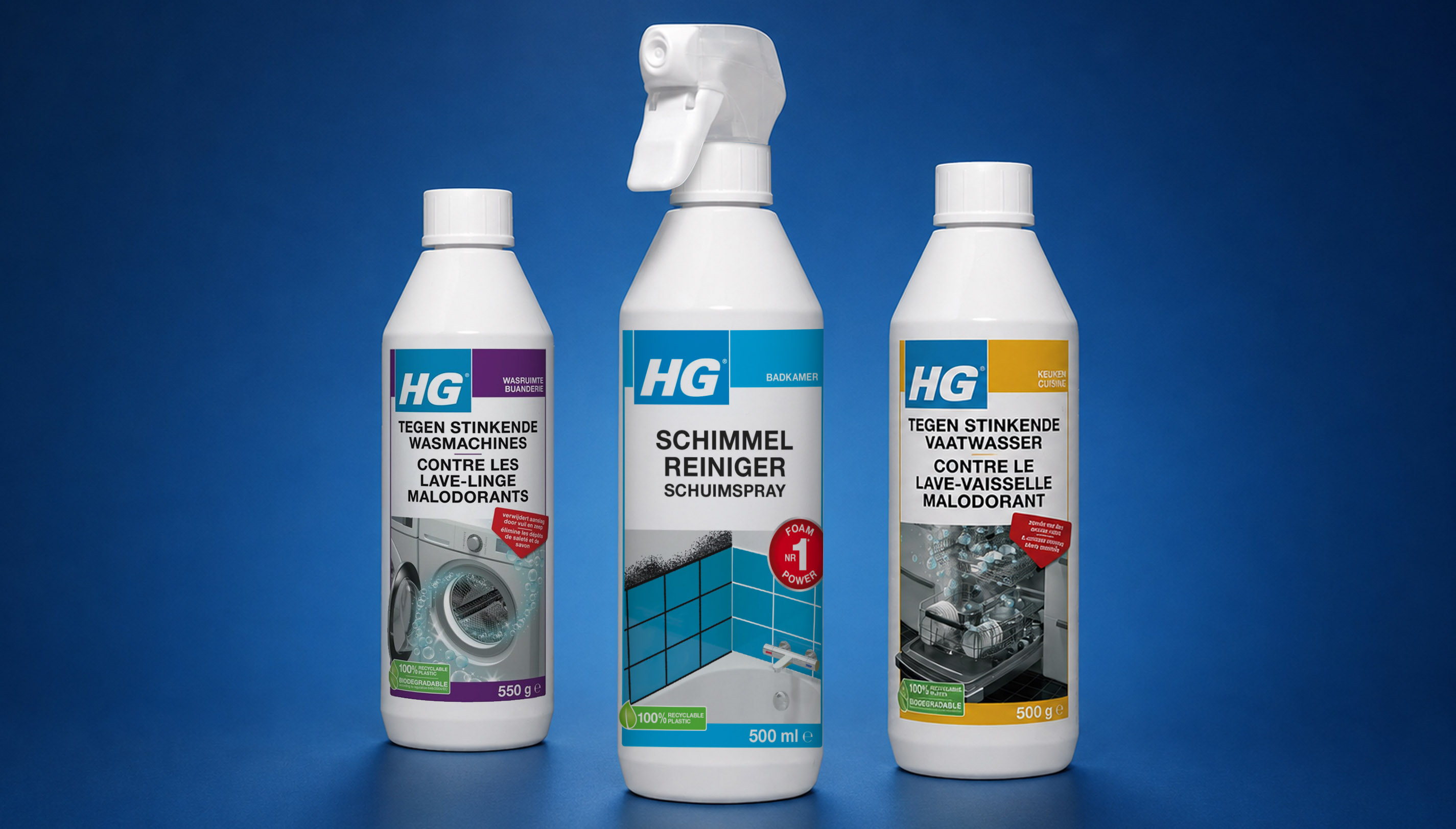
Years of growth had created a fragmented packaging system. With more than 200 SKUs, multiple languages, inconsistent hierarchies, and crowded visuals, finding the right solution had become unnecessarily difficult. On shelf, HG struggled to compete with brands that looked simpler, clearer, and easier to navigate, despite offering superior performance.

Precision, by Design

At its core, HG is built on superior quality and precision. Every product is engineered to be the very best in solving a specific problem without excess.

We translated this mindset into a visual system inspired by architectural thinking and Swiss design principles. Just as HG products remove dirt, buildup, and unnecessary residue, the identity removes visual clutter. Structured layouts, disciplined typography, and deliberate use of space create a packaging system that removes distraction and focuses attention on performance.

Designing for Choice

The redesign brings clarity to a complex product portfolio, making it easier to recognize, navigate, and choose the right solution at a glance.

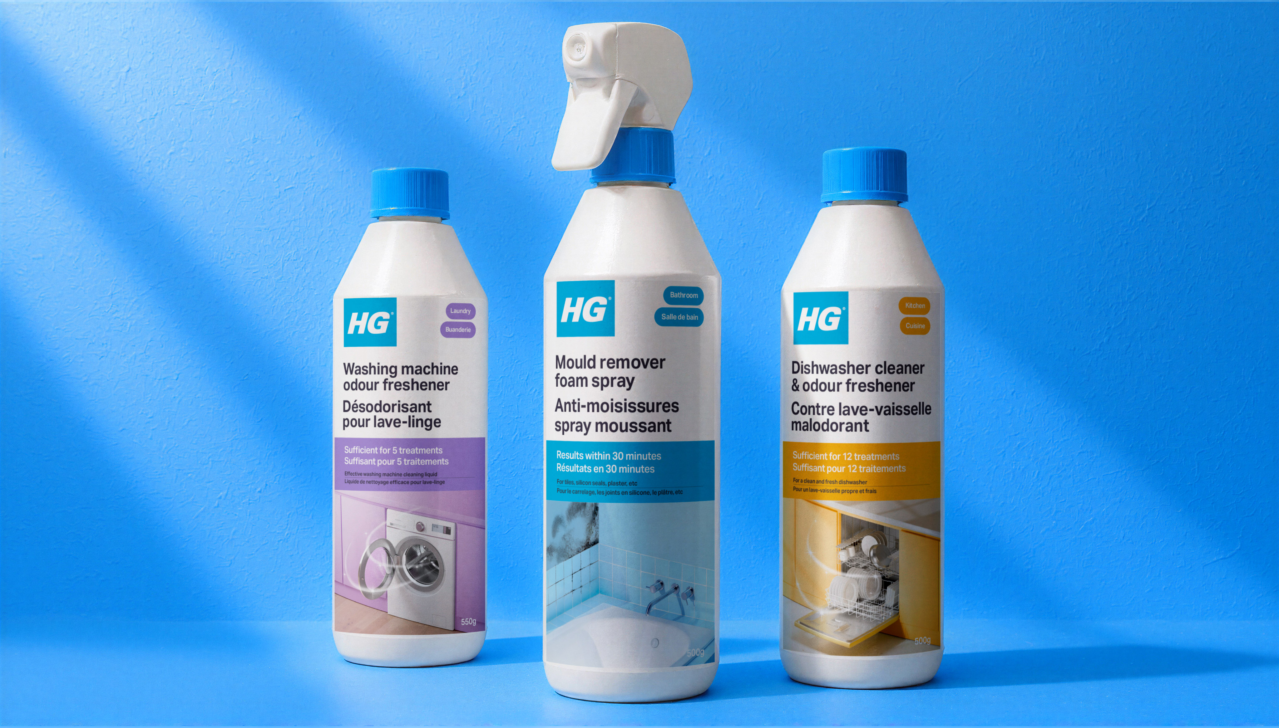
A structured grid and clear information hierarchy create consistency across the range, while a refined colour system assigns each category a distinct and recognizable presence on shelf.

The visual language was rebuilt from the ground up. Replacing cluttered and inconsistent imagery, we developed over 200 custom visuals tailored to each product category and fully integrated into the system.

Distinctive brand assets, including the iconic blue cap, were retained and elevated, preserving recognition while modernizing the overall identity.

Clarity that Performs

The result is a packaging system that reflects the precision of the products themselves: clearer to navigate, easier to trust, and stronger on shelf.

HG becomes what it has always been. The architect of excellence.

“Working with WeWantMore has been an outstanding experience. Their team of creative and strategic experts quickly understood what makes HG unique and translated our expertise into a clear, modern and highly scalable packaging system. The result is much more than a redesign. It improves navigation for consumers, makes our superior quality proposition more visible and tangible, and provides a strong platform for the next chapter of growth at HG. We are proud of what we have achieved together."

— Karel Vandamme, CEO, HG International

HG

- Precision in Packaging

+ Project information

The Architect of Excellence

Year:
2026
Client:
HG
Website:
What we did:
Brand Evolution ,
Packaging

From Clutter to Clarity

HG is the expert. For over 60 years, the brand has been trusted across the Benelux for highly effective, problem-specific cleaning solutions.

But as the range expanded, the brand lost the clarity the products were known for.

Years of growth had created a fragmented packaging system. With more than 200 SKUs, multiple languages, inconsistent hierarchies, and crowded visuals, finding the right solution had become unnecessarily difficult. On shelf, HG struggled to compete with brands that looked simpler, clearer, and easier to navigate, despite offering superior performance.

Precision, by Design

At its core, HG is built on superior quality and precision. Every product is engineered to be the very best in solving a specific problem without excess.

We translated this mindset into a visual system inspired by architectural thinking and Swiss design principles. Just as HG products remove dirt, buildup, and unnecessary residue, the identity removes visual clutter. Structured layouts, disciplined typography, and deliberate use of space create a packaging system that removes distraction and focuses attention on performance.

Designing for Choice

The redesign brings clarity to a complex product portfolio, making it easier to recognize, navigate, and choose the right solution at a glance.

A structured grid and clear information hierarchy create consistency across the range, while a refined colour system assigns each category a distinct and recognizable presence on shelf.

The visual language was rebuilt from the ground up. Replacing cluttered and inconsistent imagery, we developed over 200 custom visuals tailored to each product category and fully integrated into the system.

Distinctive brand assets, including the iconic blue cap, were retained and elevated, preserving recognition while modernizing the overall identity.

Clarity that Performs

The result is a packaging system that reflects the precision of the products themselves: clearer to navigate, easier to trust, and stronger on shelf.

HG becomes what it has always been. The architect of excellence.

“Working with WeWantMore has been an outstanding experience. Their team of creative and strategic experts quickly understood what makes HG unique and translated our expertise into a clear, modern and highly scalable packaging system. The result is much more than a redesign. It improves navigation for consumers, makes our superior quality proposition more visible and tangible, and provides a strong platform for the next chapter of growth at HG. We are proud of what we have achieved together."

— Karel Vandamme, CEO, HG International

Contact us

We’re only a call or click away

Let's talk

Newsletter

You're successfully subscribed!