Brussels Airlines

- Small details. A world of difference.

Small details. A world of difference.

Year:
2025
Client:
Brussels Airlines
Awards:
Creative Belgium Awards
2025
Shortlist

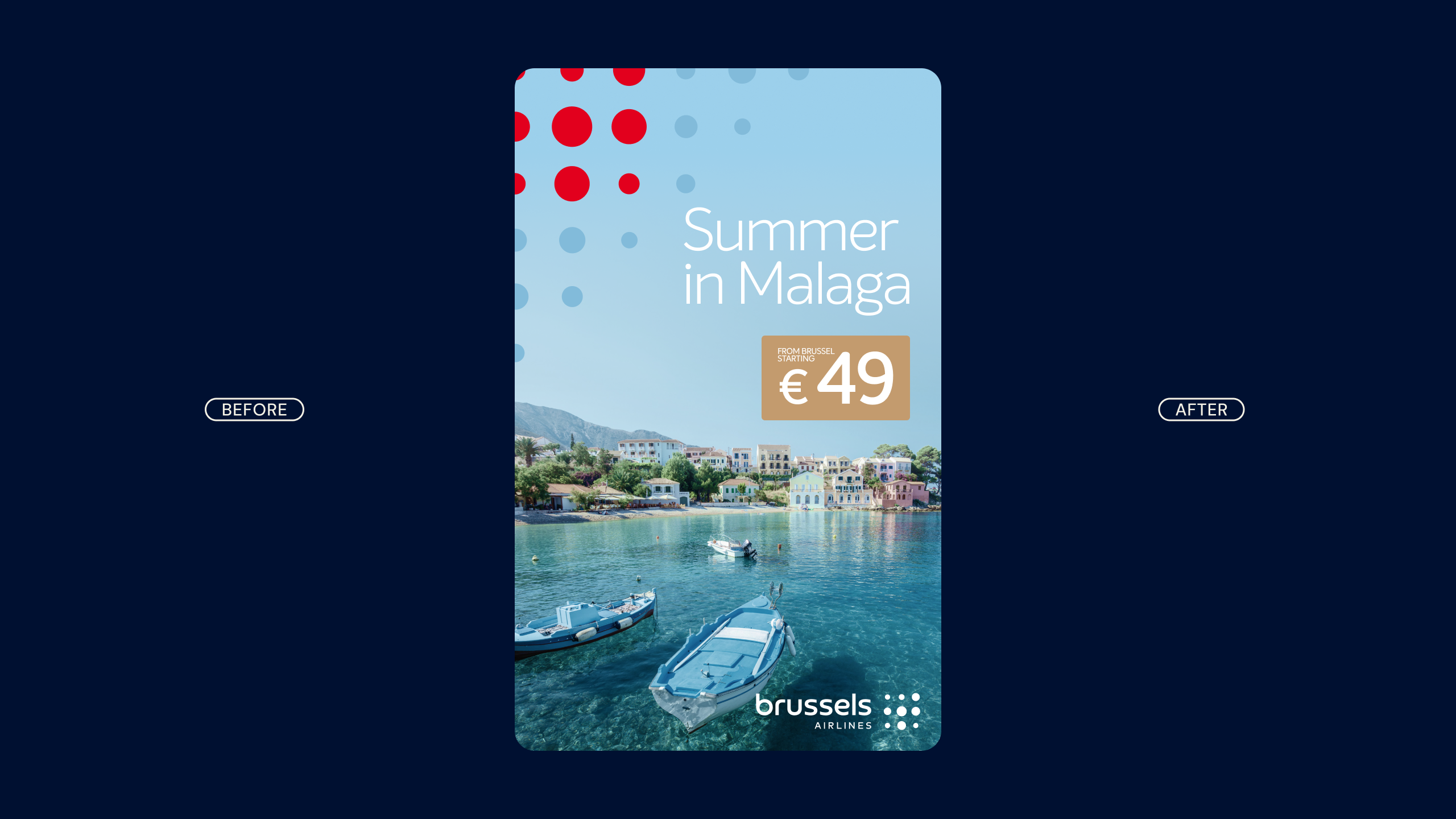
Brussels Airlines, part of the Lufthansa Group, rebranded in 2021, introducing a new logo and colour palette. However, even after the rebrand, Brussels Airlines felt distant and corporate—worlds apart from the warm, welcoming experience onboard.

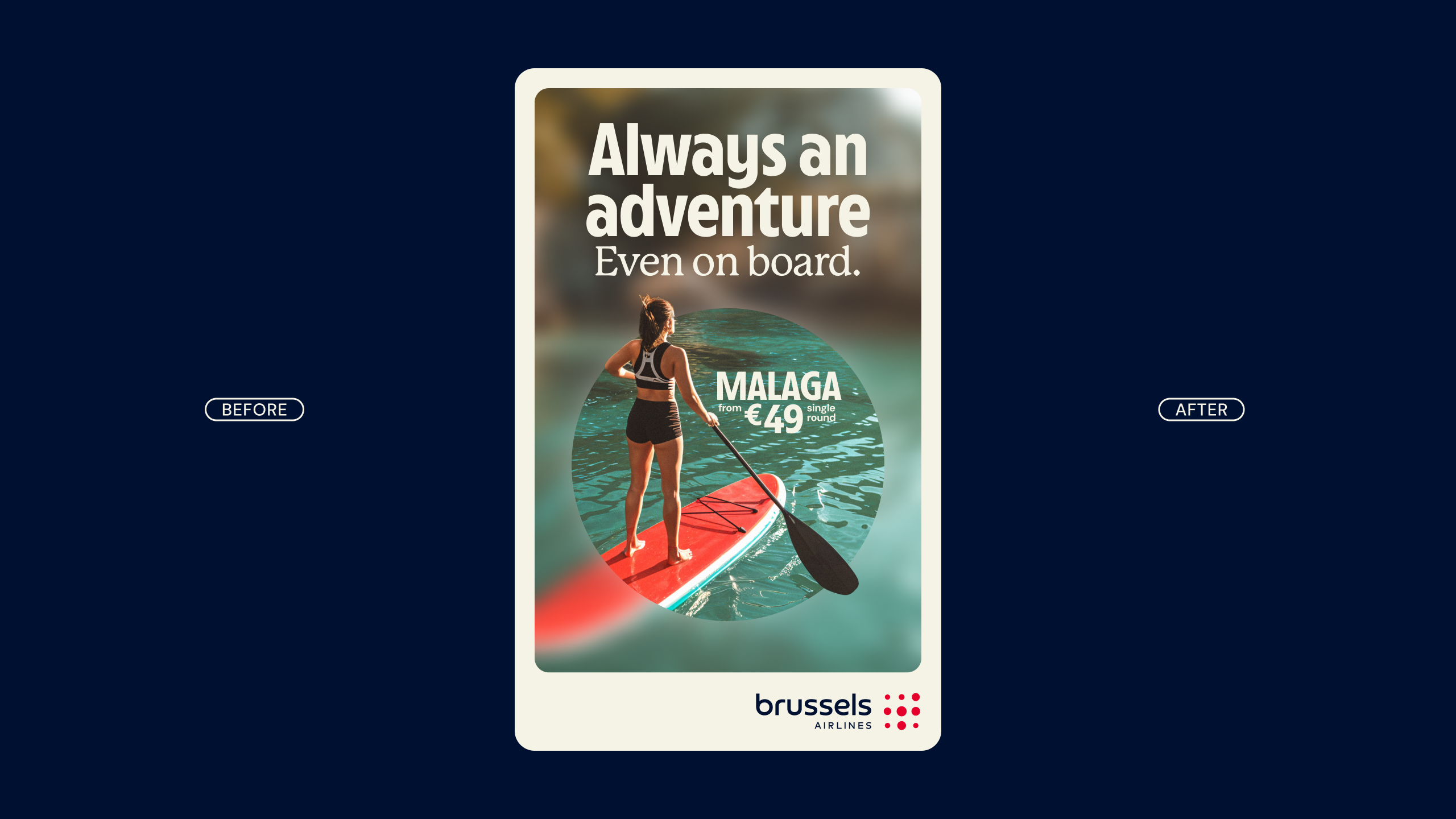
We rallied the airline around a simple idea: “Small details, a world of difference,” rooted in the brand’s promise. A single dot became the core design element, symbolizing a focus on the small touches that make a big impact on every journey.

Building on that, we crafted a bespoke font—Cirrus Sans—inspired by aviation’s golden age and classic travel posters, added warmth to the color palette, and redefined the photography style. Each choice reinforces the idea that every detail matters. The result: a more distinctive, consistent brand with stronger recognition across every touchpoint.

“It was a real challenge to make our brand personality truly tangible at every step of the customer journey. This brand refresh isn’t just a layer of advertising polish, but a genuine premium identity brought to life—from the aircraft to the lounges. Thanks to WeWantMore, we finally have a brand that is consistent down to the smallest details and perfectly reflects who we are: human, welcoming, and Belgian with a playful wink.”

— Michel Moriaux, Marketing Director at Brussels Airlines

Brussels Airlines

- Small details. A world of difference.

+ Project information
Small details. A world of difference.

Year:
2025
Client:
Brussels Airlines
What we did:
Brand Evolution ,
Motion Design ,
Custom Typeface
Awards:
Creative Belgium Awards
2025
Shortlist

Brussels Airlines, part of the Lufthansa Group, rebranded in 2021, introducing a new logo and colour palette. However, even after the rebrand, Brussels Airlines felt distant and corporate—worlds apart from the warm, welcoming experience onboard.

We rallied the airline around a simple idea: “Small details, a world of difference,” rooted in the brand’s promise. A single dot became the core design element, symbolizing a focus on the small touches that make a big impact on every journey.

Building on that, we crafted a bespoke font—Cirrus Sans—inspired by aviation’s golden age and classic travel posters, added warmth to the color palette, and redefined the photography style. Each choice reinforces the idea that every detail matters. The result: a more distinctive, consistent brand with stronger recognition across every touchpoint.

“It was a real challenge to make our brand personality truly tangible at every step of the customer journey. This brand refresh isn’t just a layer of advertising polish, but a genuine premium identity brought to life—from the aircraft to the lounges. Thanks to WeWantMore, we finally have a brand that is consistent down to the smallest details and perfectly reflects who we are: human, welcoming, and Belgian with a playful wink.”

— Michel Moriaux, Marketing Director at Brussels Airlines

Contact us

We’re only a call or click away

Let's talk

Newsletter

You're successfully subscribed!